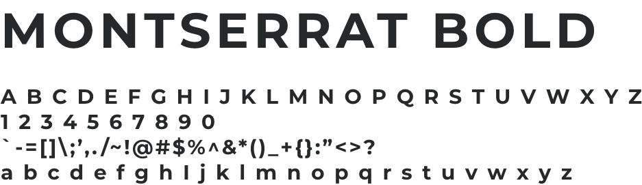
ETEREO

Overview: This project was part of my university coursework. Despite Etereo being a fictional brand, I treated the design process as though it were for a real company.
Objective: To create a sustainable chocolate brand and package design from Honduras.
Project Timeline: Two weeks.
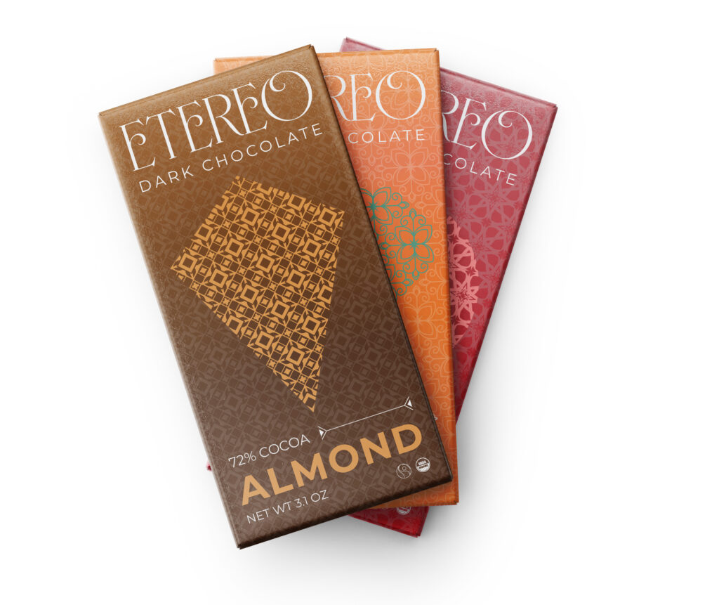
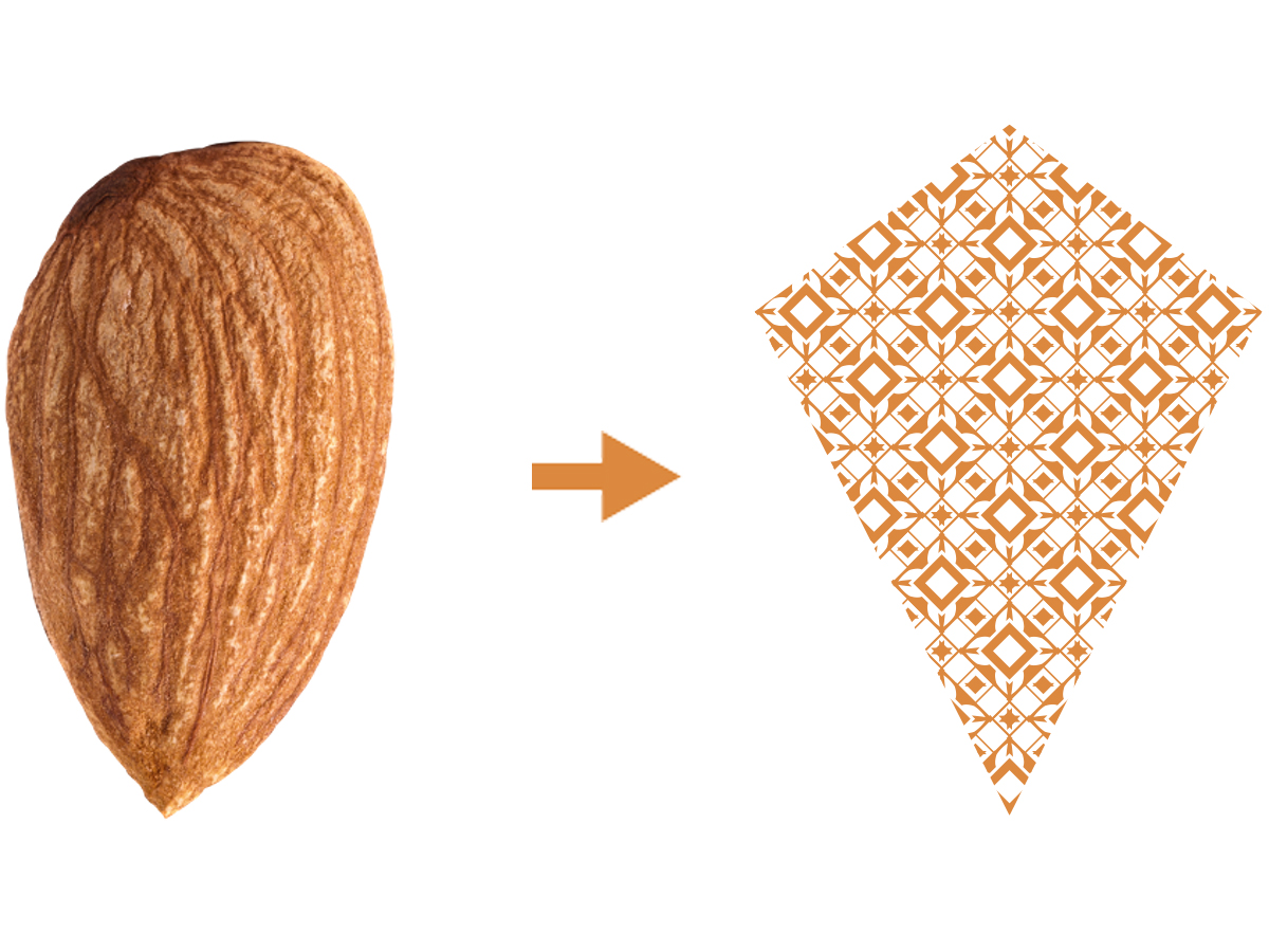
Target Market: Eco & Design-conscious consumers who prioritize sustainability and are drawn to modern, aesthetically pleasing packaging that emphasizes ethical sourcing, environmental responsibility, and cultural appreciation.
Tools: Illustrator and Photoshop.
Deliverables: Chocolate package design.

Design Brief

The name of the brand is ETEREO meaning ethereal in Spanish. Hence the slogan for the brand is Ethereal Taste.

The strategy for the package design involves integrating modern patterns while paying homage to Honduran culture. By infusing these elements, the intention is to create a visual identity that resonates with consumers, evoking a sense of wonder and anticipation for the exceptional flavor.

Ultimately, the goal is to craft an enticing and distinctive brand that captures the essence of Honduras while promising a taste sensation that transcends the ordinary, embodying the ethereal nature of the product.​​

Moodboard

Package designs needed to be colorful to represent the vibrant life of Honduras correctly and to showcase that ethereal look.

Etereo moodboard

Patterns

Three different patterns for three different flavors.
Almond - sharp and square pattern symbol to illustrate crunchiness.
Papaya - smooth curved pattern symbol to illustrate the papaya symbol.
Rambutan - sharp pointy spiked pattern to illustrate the rambutan’s pointy sharp outer shell.

Shapes

Process & Struggles

When creating the brand I wanted the brand to be known that it was from Honduras. That’s why I got inspiration from the flag of Honduras. I started creating logos based on star and floral aspects to illustrate Honduras and sustainability. However, it got my attention that the logos I created made it look more corporate feel to it. That’s why I changed.

I chose a typography-based logo with no distinct color because relying on one blue color did not represent the vibrant life of Honduras. Rather I made the logo black and white for its colors to be editable. Also, I made three sub-logo colors for each flavor.

proccess work

Logo Variations

Color Palette

#272829

#3D1900

#DE5E3E

#FCE58B

#B1424A

#FFFFFF

#DC893F

#D88D6C

#4D9078

#FF8585

Typography