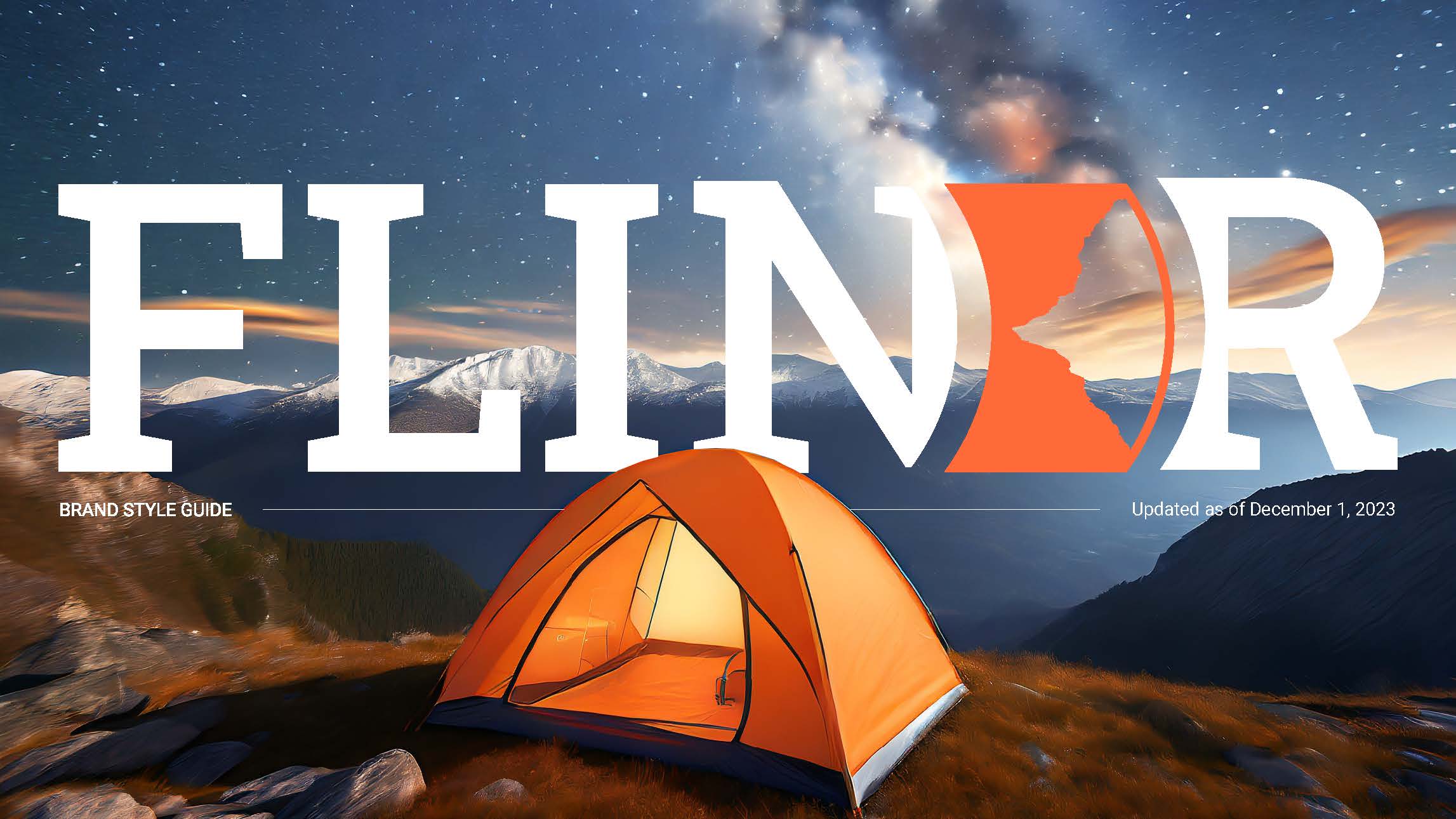
FLINDR
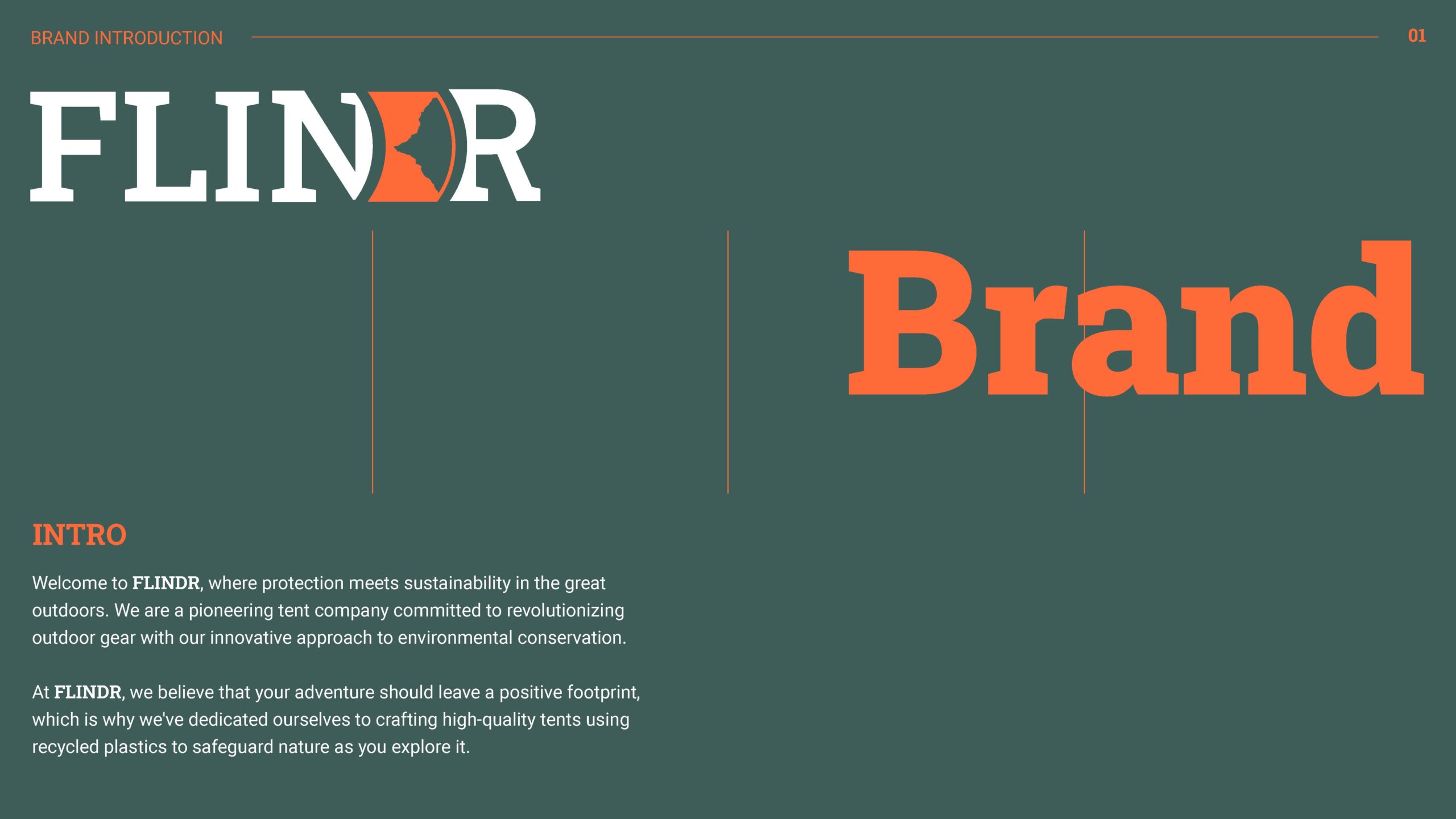
Overview: This project was completed as part of my university coursework. Although Flindr is a fictional brand, I approached the design as if it were real. Additionally, while I utilized artificially generated images in the creation process, I applied extensive editing to ensure a polished and aesthetically pleasing final product.
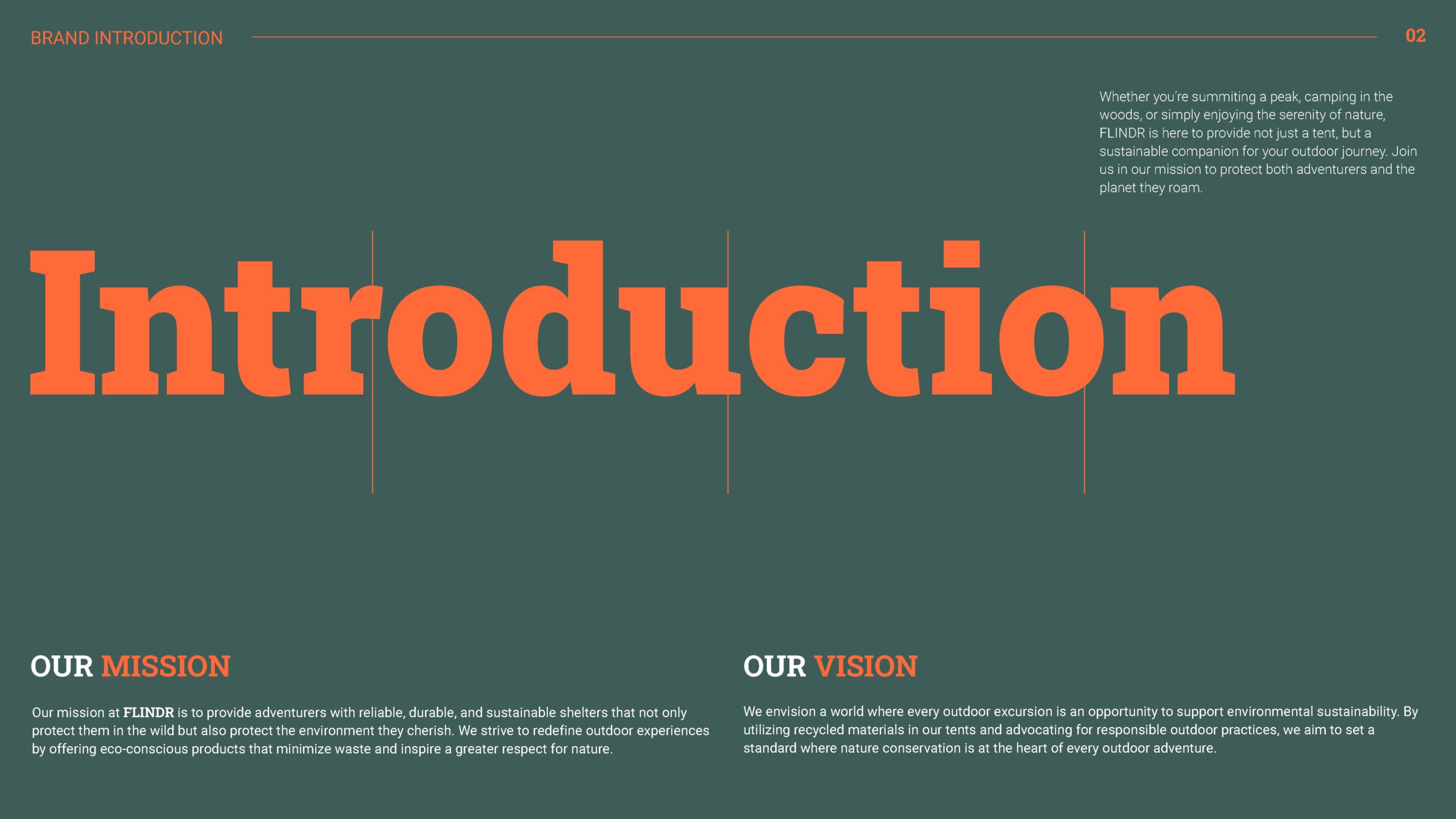
Objective: To create a comprehensive brand identity and style guide that reflects FLINDR's commitment to sustainability, outdoor adventure, and environmental consciousness. The brand identity should be cohesive, memorable, and versatile, while the style guide should provide clear guidelines for consistent implementation across all brand touch points.
Project Timeline: Two weeks.
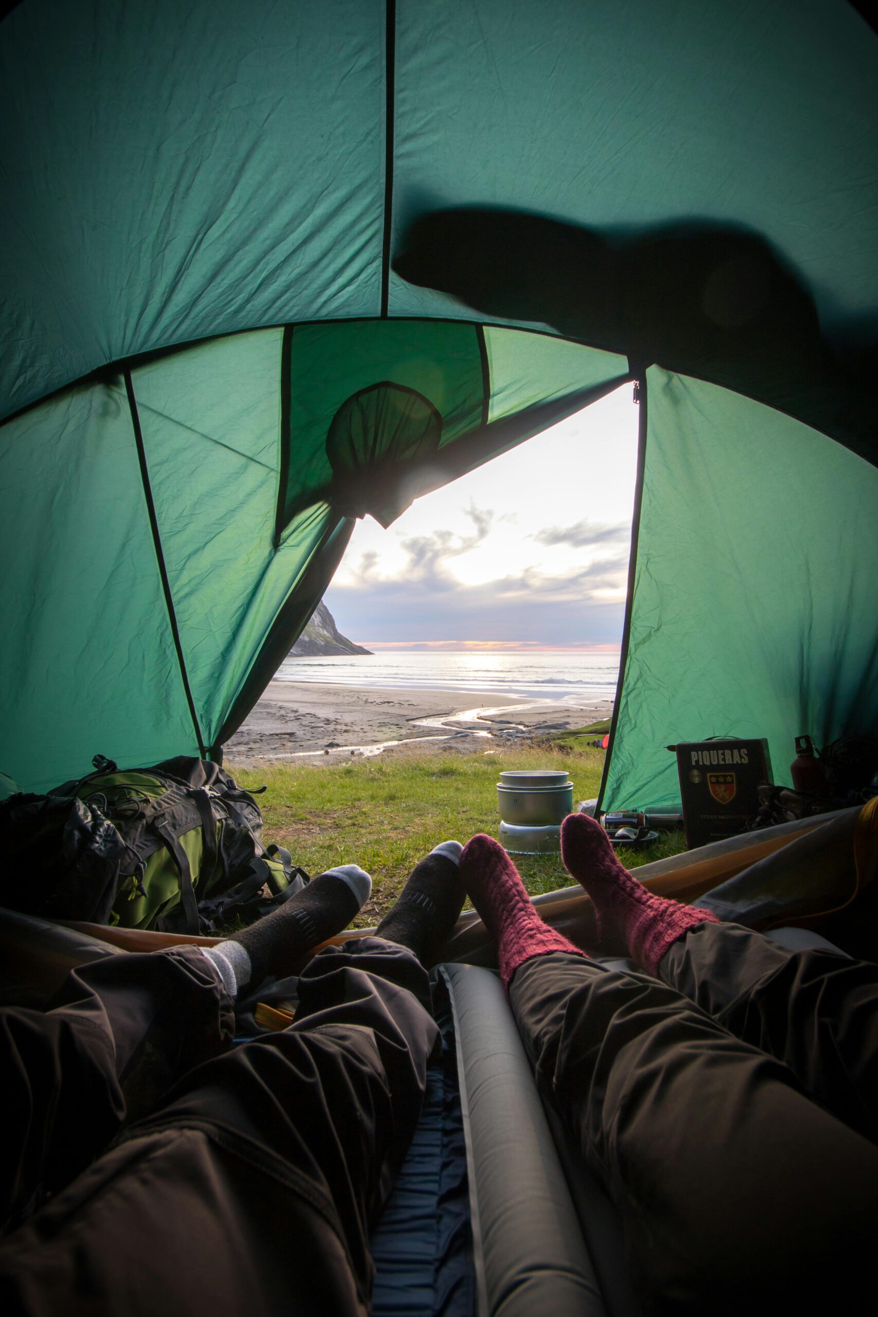
Target Market: Outdoor enthusiasts, eco-conscious consumers, adventurers, hikers, campers, and nature lovers.
Tools: Illustrator, Photoshop and Adobe Firefly.
Deliverables: Brand Logo and Style Guide.
Problem Statement
The absence of a unified visual language hampers FLINDR's ability to build brand recognition, connect with consumers, and foster loyalty among outdoor enthusiasts seeking environmentally conscious tents. Therefore, developing a robust style guide is imperative to align FLINDR's branding efforts, convey its unique brand attributes, and enhance its overall brand presence in the market.
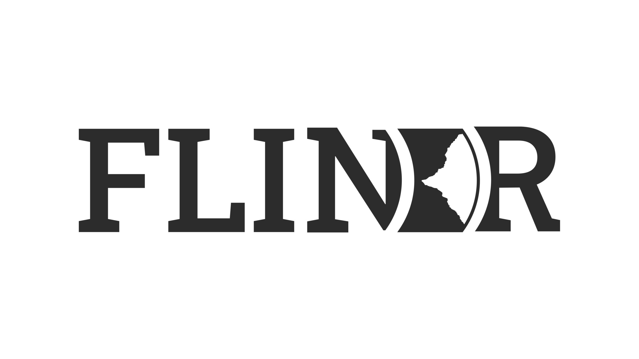
Brand Logo
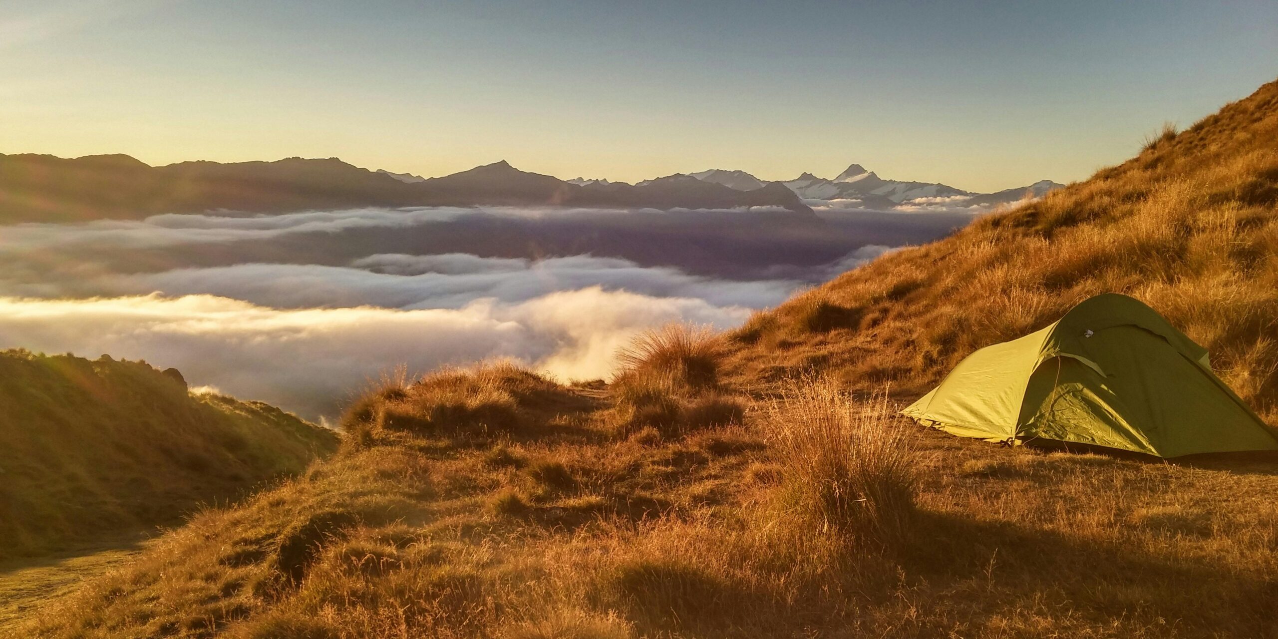
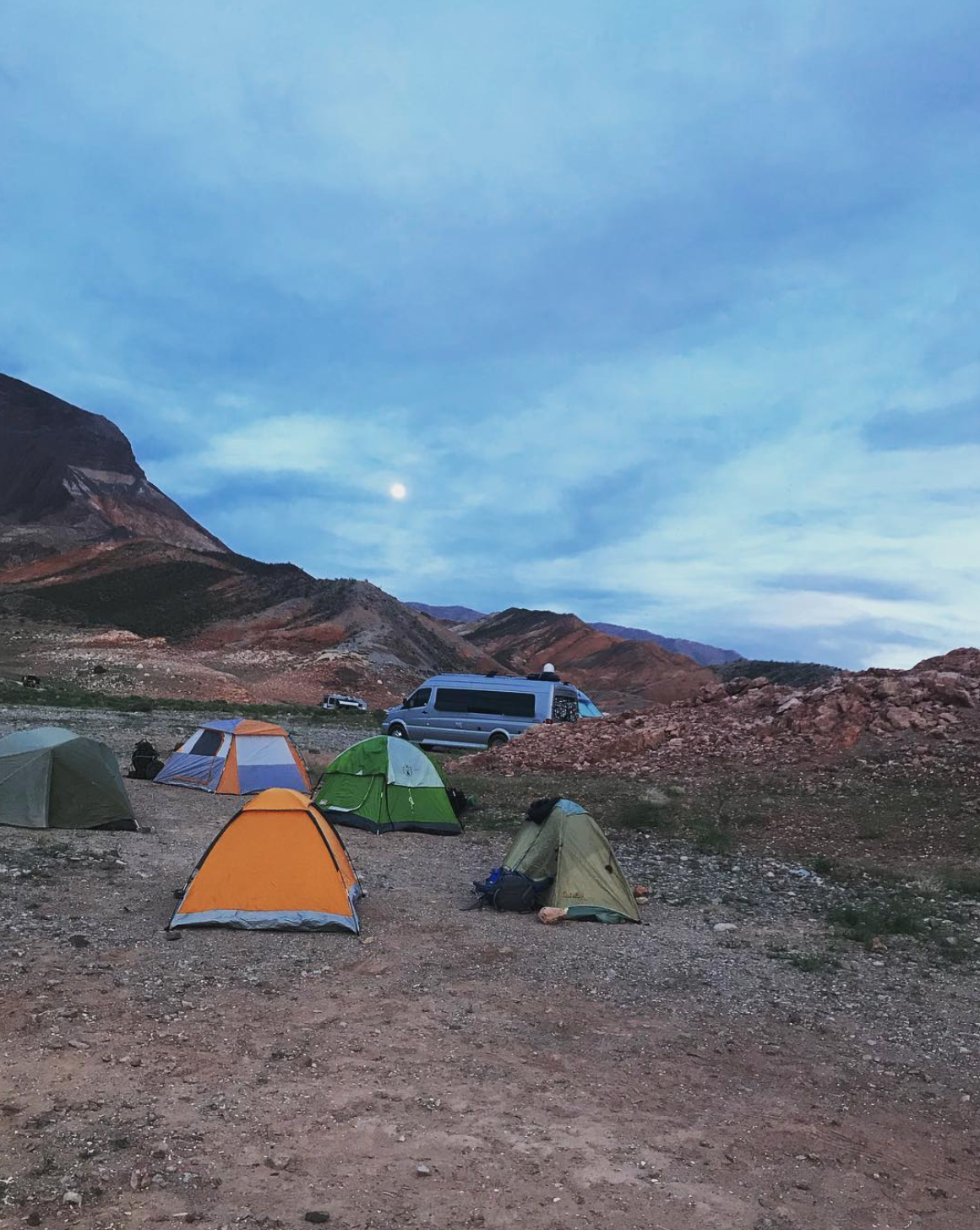
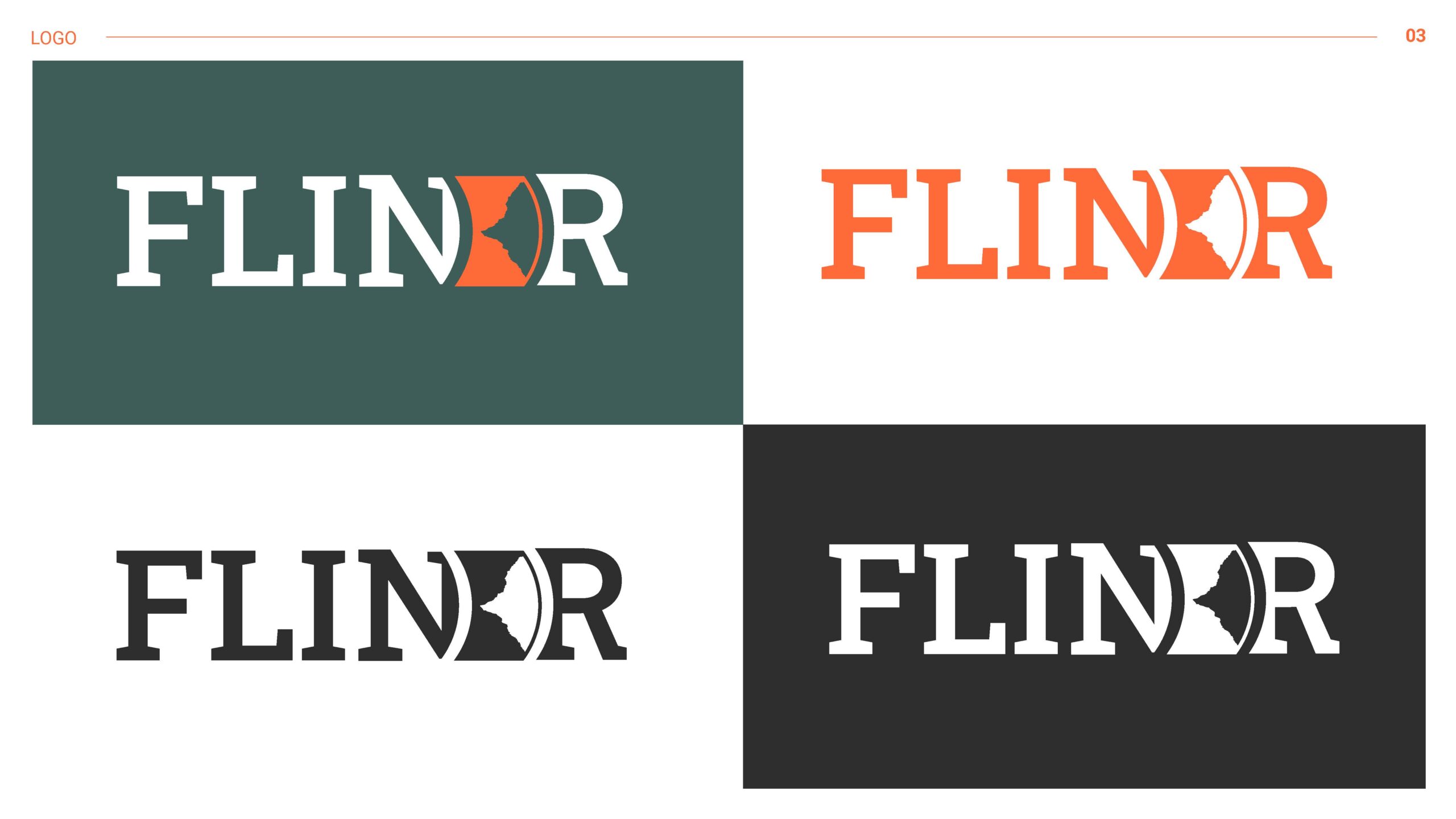
The inspiration for the FLINDR logo was deeply rooted in my connection to Utah's breathtaking landscapes, particularly my favorite place where I took the photo as shown below. This special location, with its towering uneven rock formations yet almost symmetrical outline, inspired me to create the logo out of it.
After having the outline for the logo I started rapid sketching, then I selected the best ones and illustrated them:
I decided the last one would represent the brand well with nature and the tent shape sideways however after getting feedback, the letter R was not well visible and will have accessibility issues. Moreover, I got feedback that the logo was not well balanced since the left side is curved and the right side has a sharp edge.
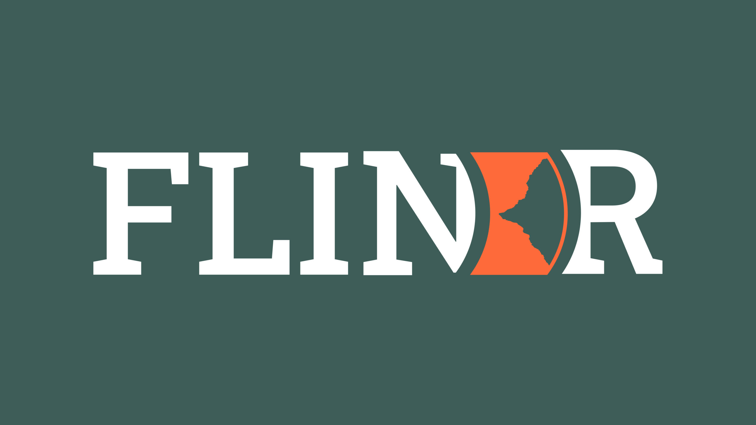
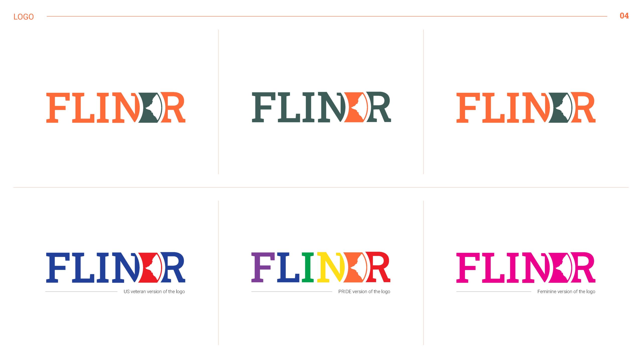
After getting feedback, I brainstormed more and implemented the changes, hence here is the final brand logo design:
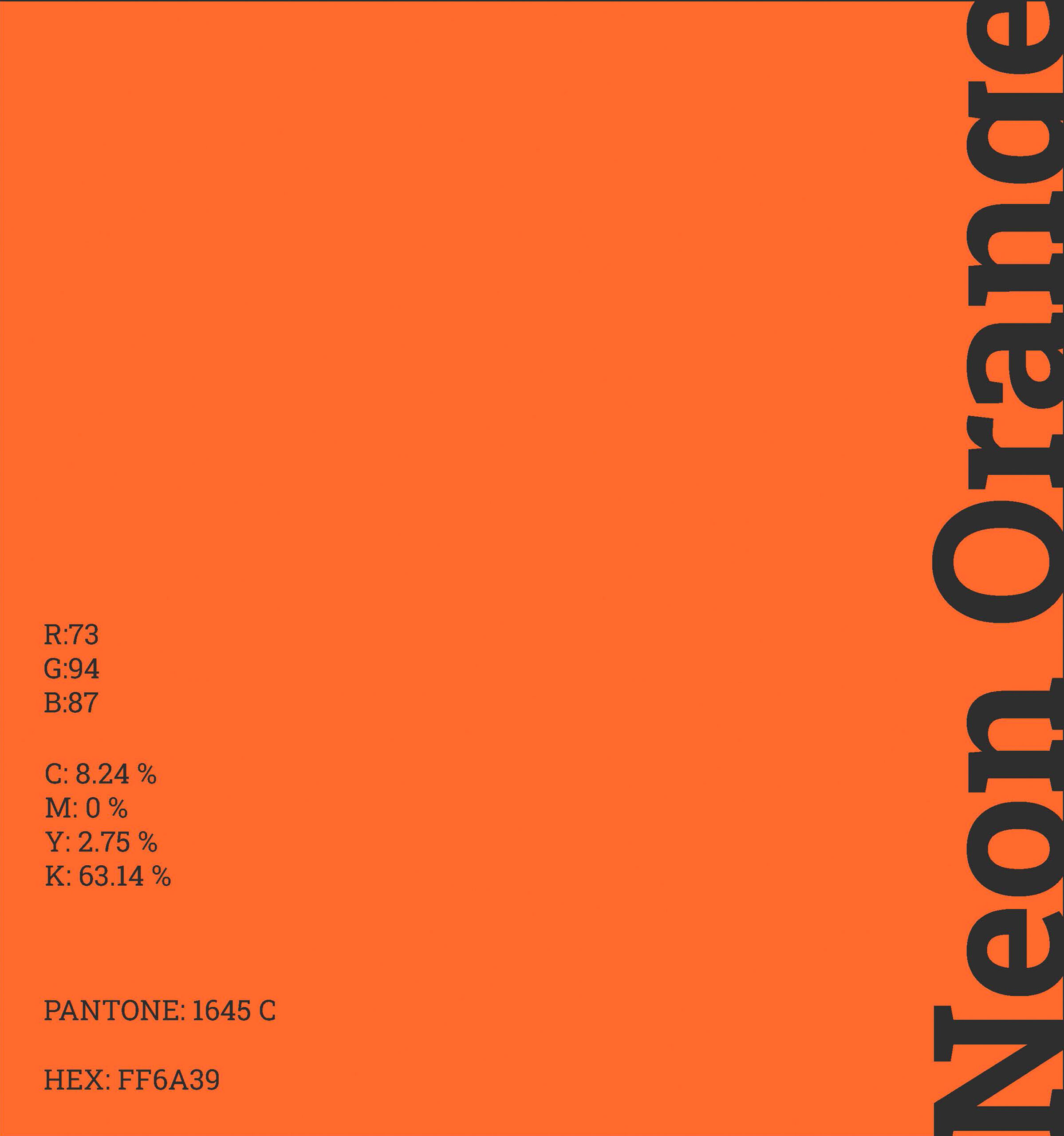
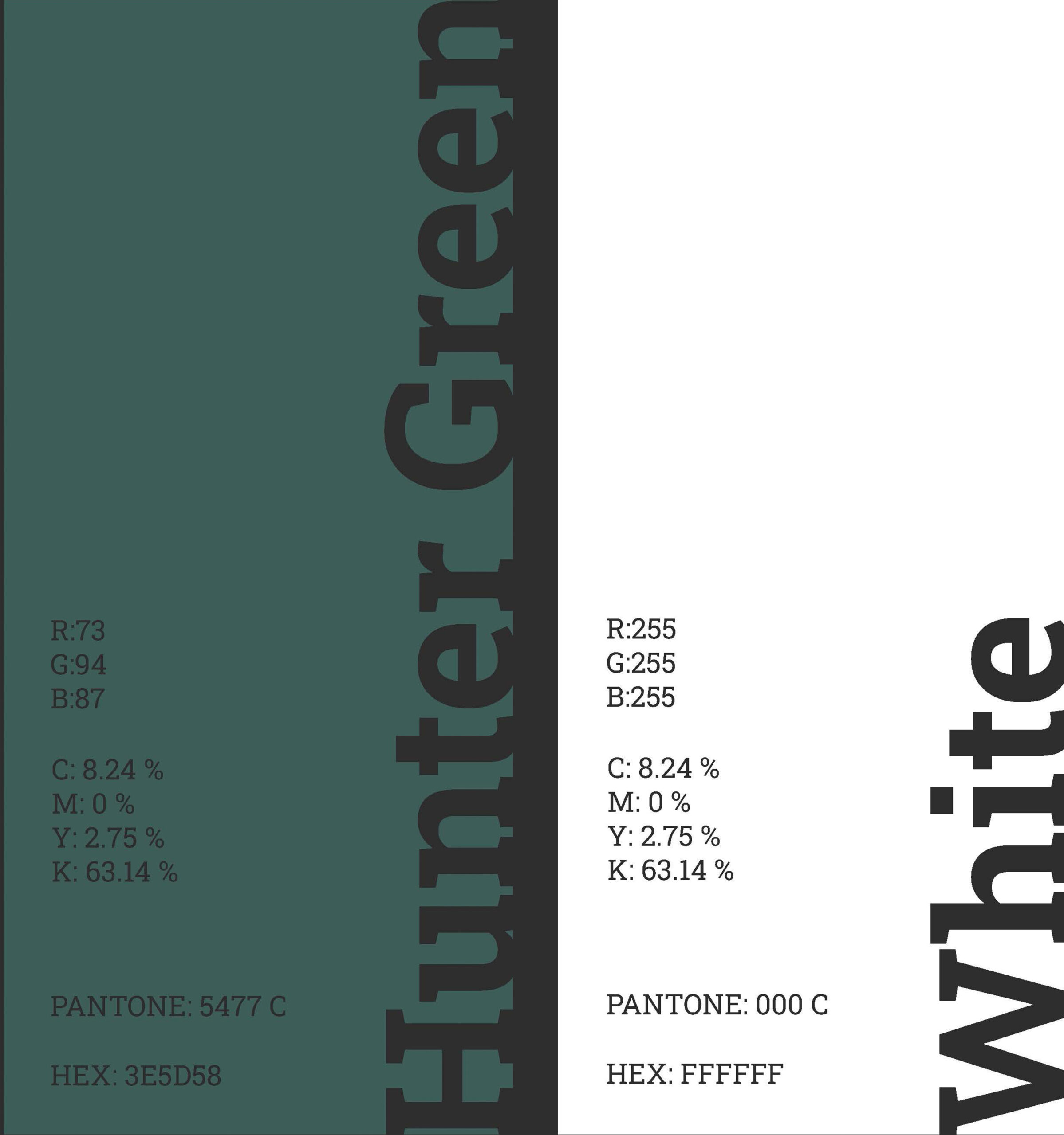
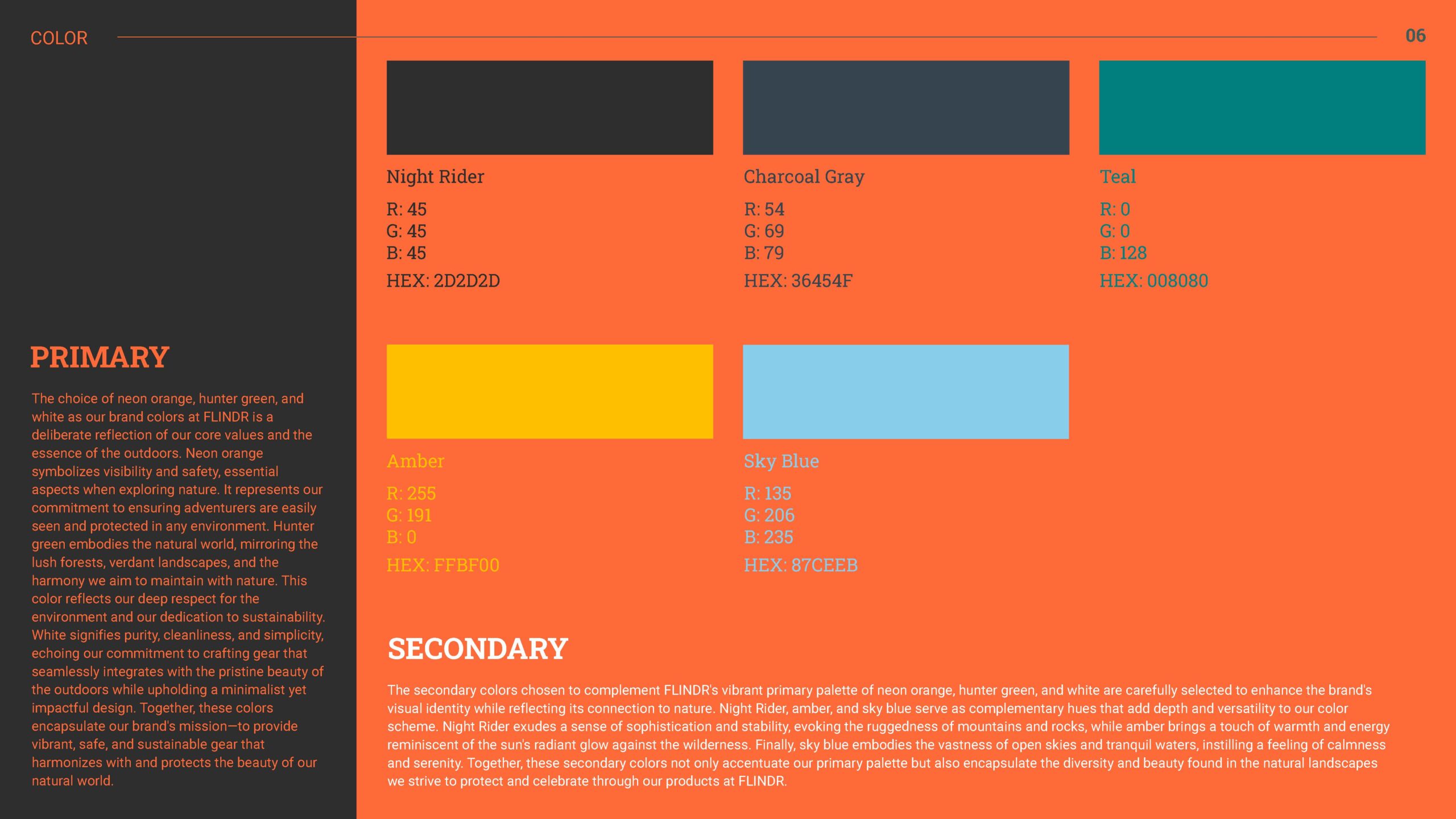
Color Palette
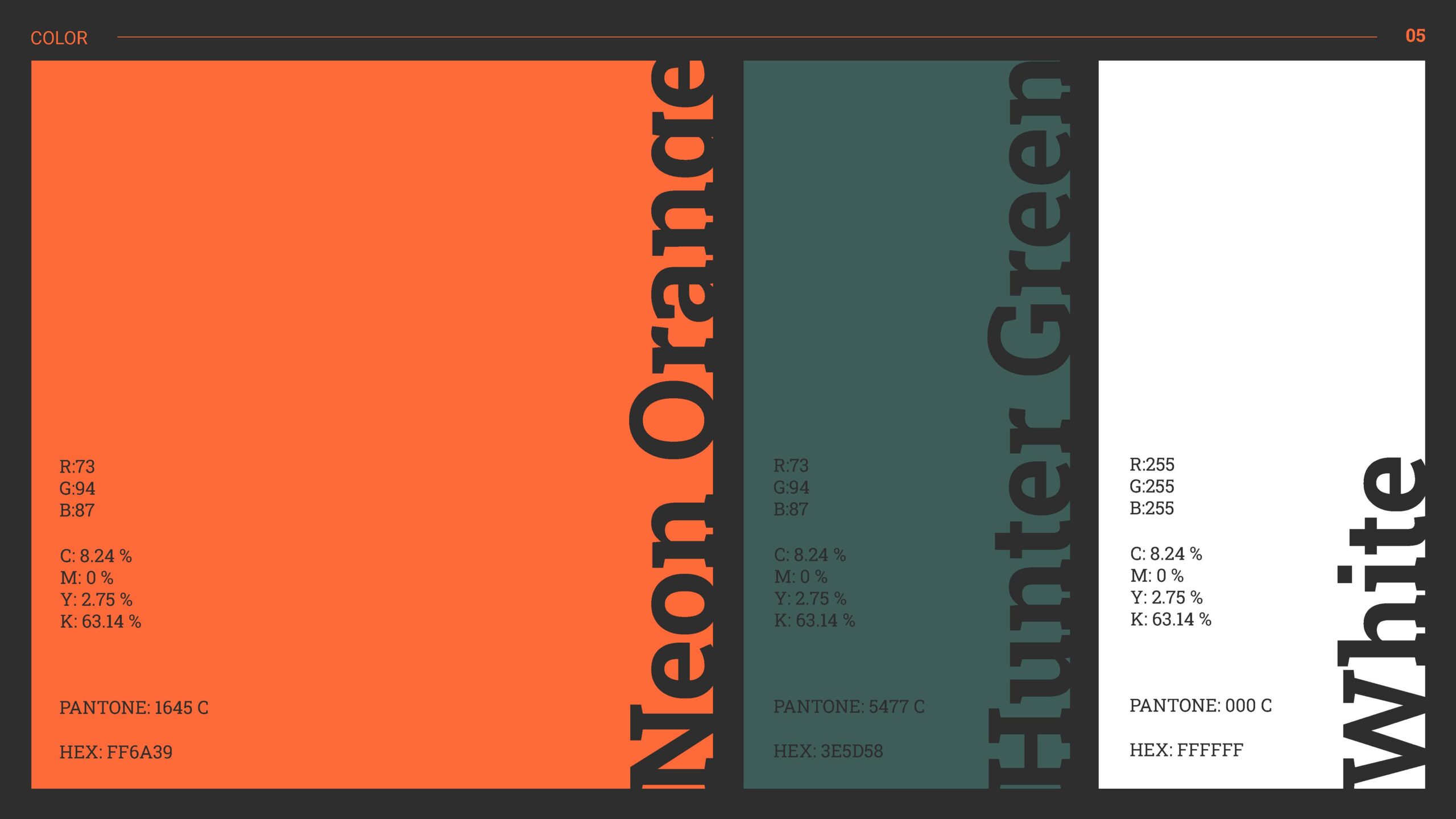
The choice of neon orange, hunter green, and white as the brand colors was a deliberate choice of the brand's core values and the essence of the outdoors.
Neon orange symbolizes visibility and safety, essential aspects when exploring nature. It represents the brand's commitment to ensuring adventurers are easily seen and protected in any environment.
Hunter green symbolizes the natural world, mirroring the lush forests, verdant landscapes, and the harmony FLINDR aims to maintain with nature. This color reflects the brand's deep respect for the environment and its dedication to sustainability.
White signifies purity, cleanliness, and simplicity, echoing the brand's commitment to crafting gear that seamlessly integrates with the beauty of the outdoors while upholding a minimalist yet impactful design.
Together, these colors encapsulate the brand's mission—to provide vibrant, safe, and sustainable gear that harmonizes with and protects the beauty of the natural world.
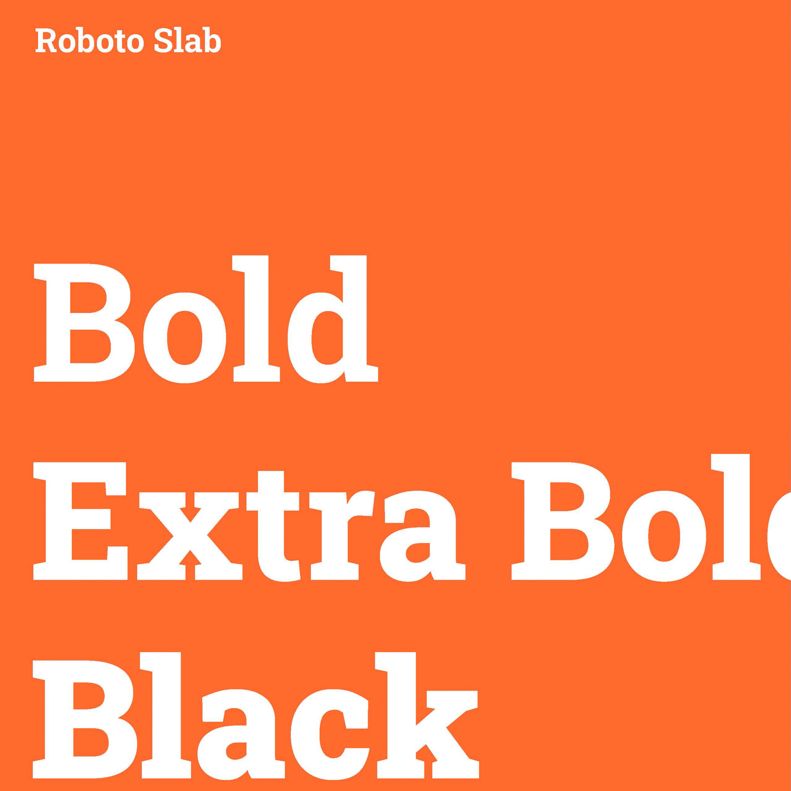
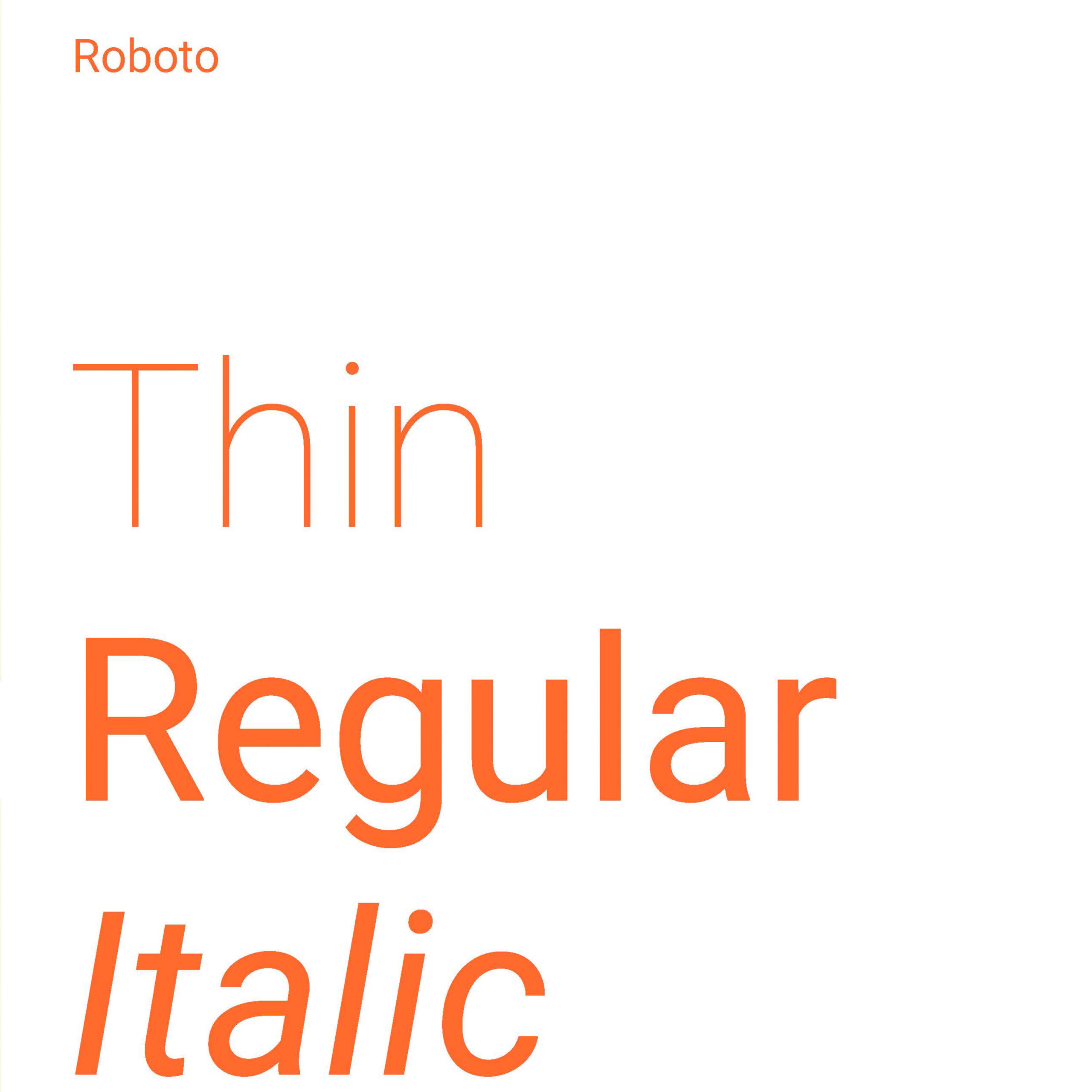
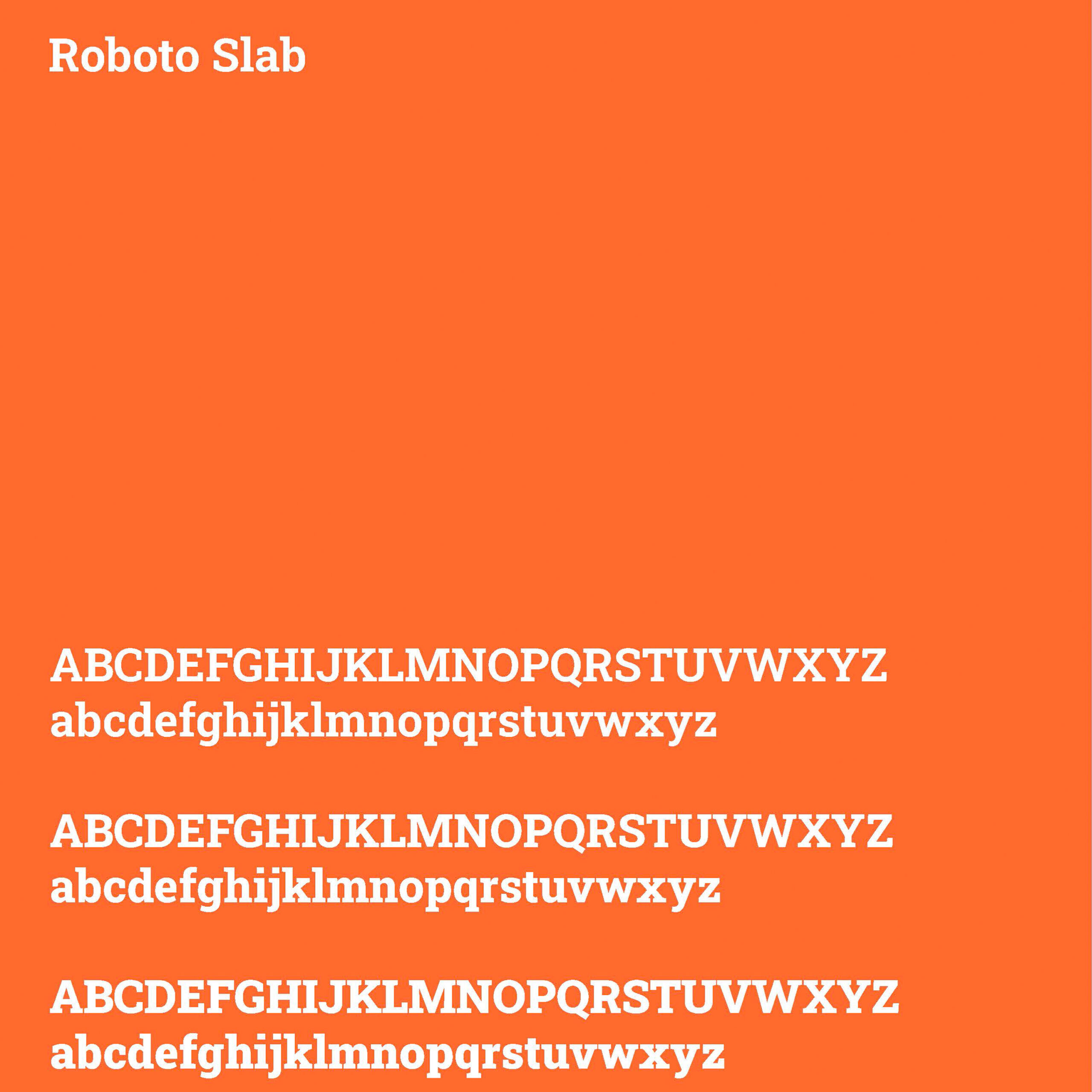
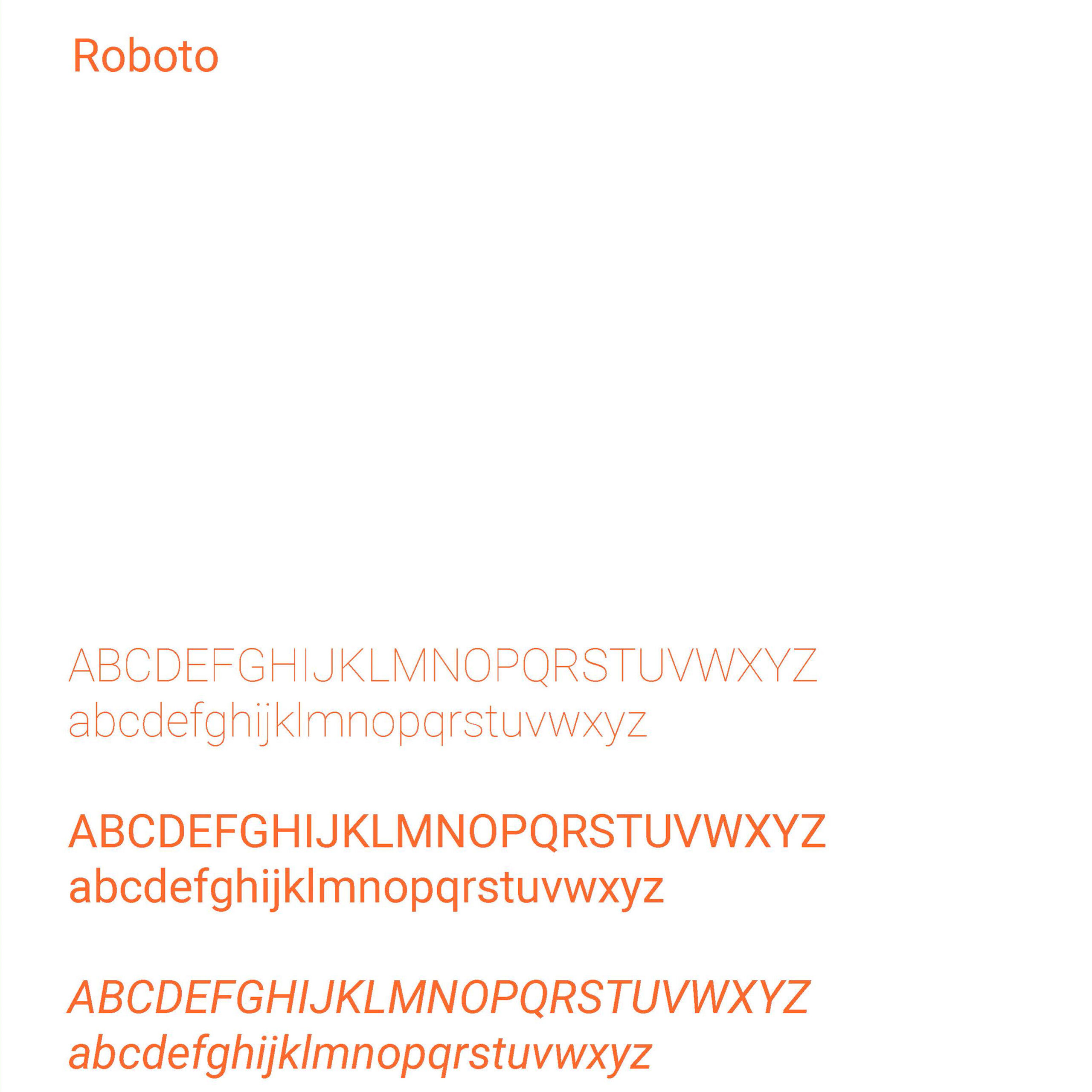
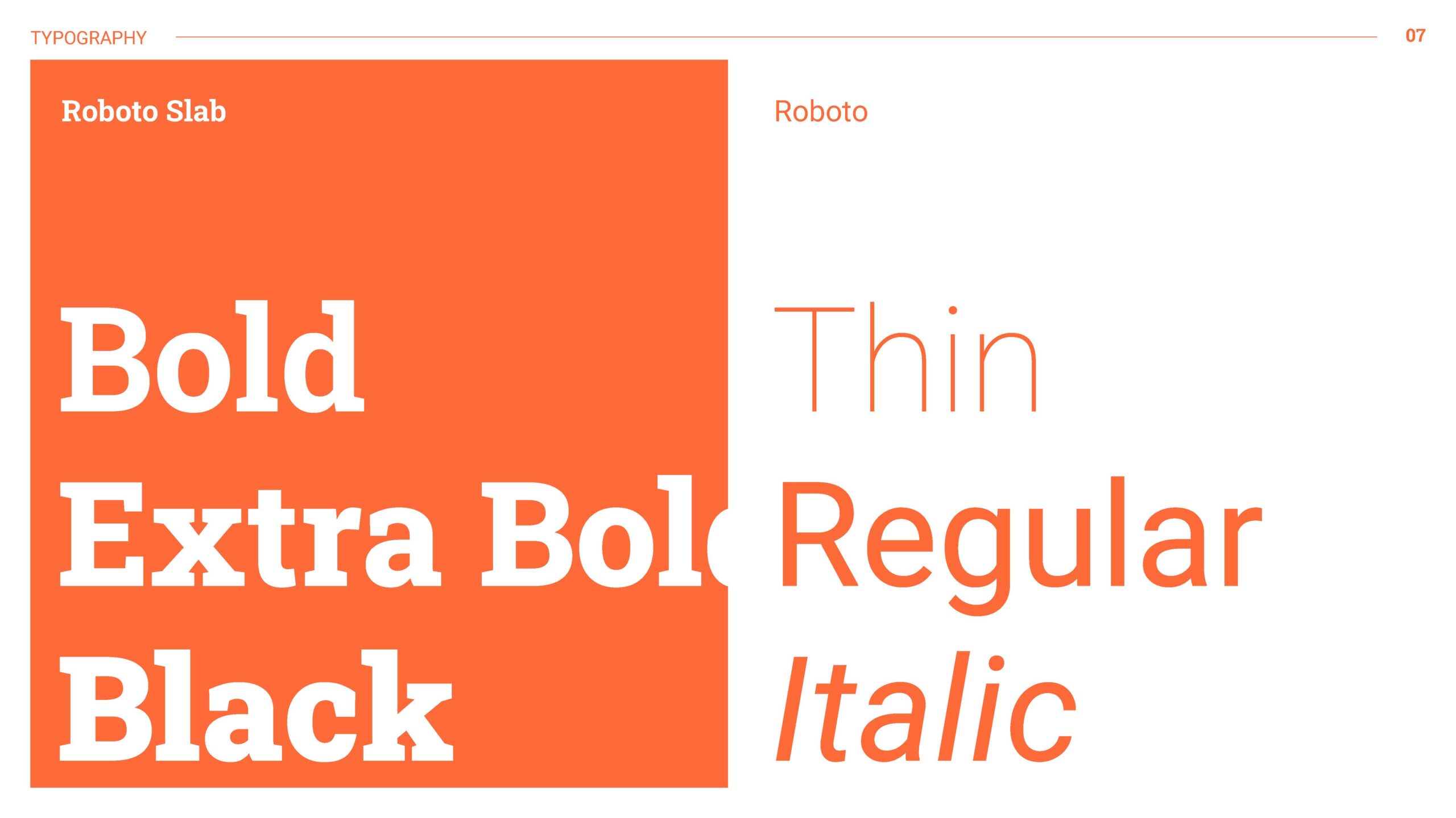
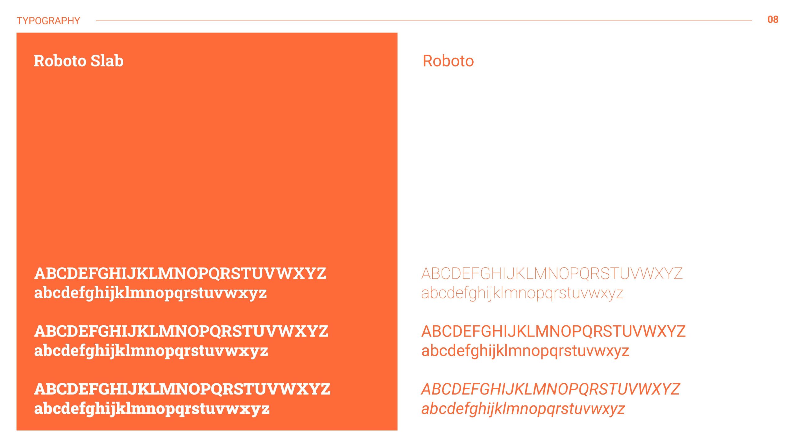
Typography
The choice of Roboto Slab and Roboto typefaces for FLINDR's brand typography was driven by a combination of factors aimed at achieving optimal readability, modern aesthetics, and versatile application across various brand touchpoints.
With its sturdy serifs and balanced proportions, the Roboto Slab gives a sense of reliability and durability, showcasing FLINDR's commitment to providing robust and long-lasting outdoor gear. Complementing this, Roboto offers a clean and contemporary sans-serif option, ensuring clarity and legibility in both digital and print materials.
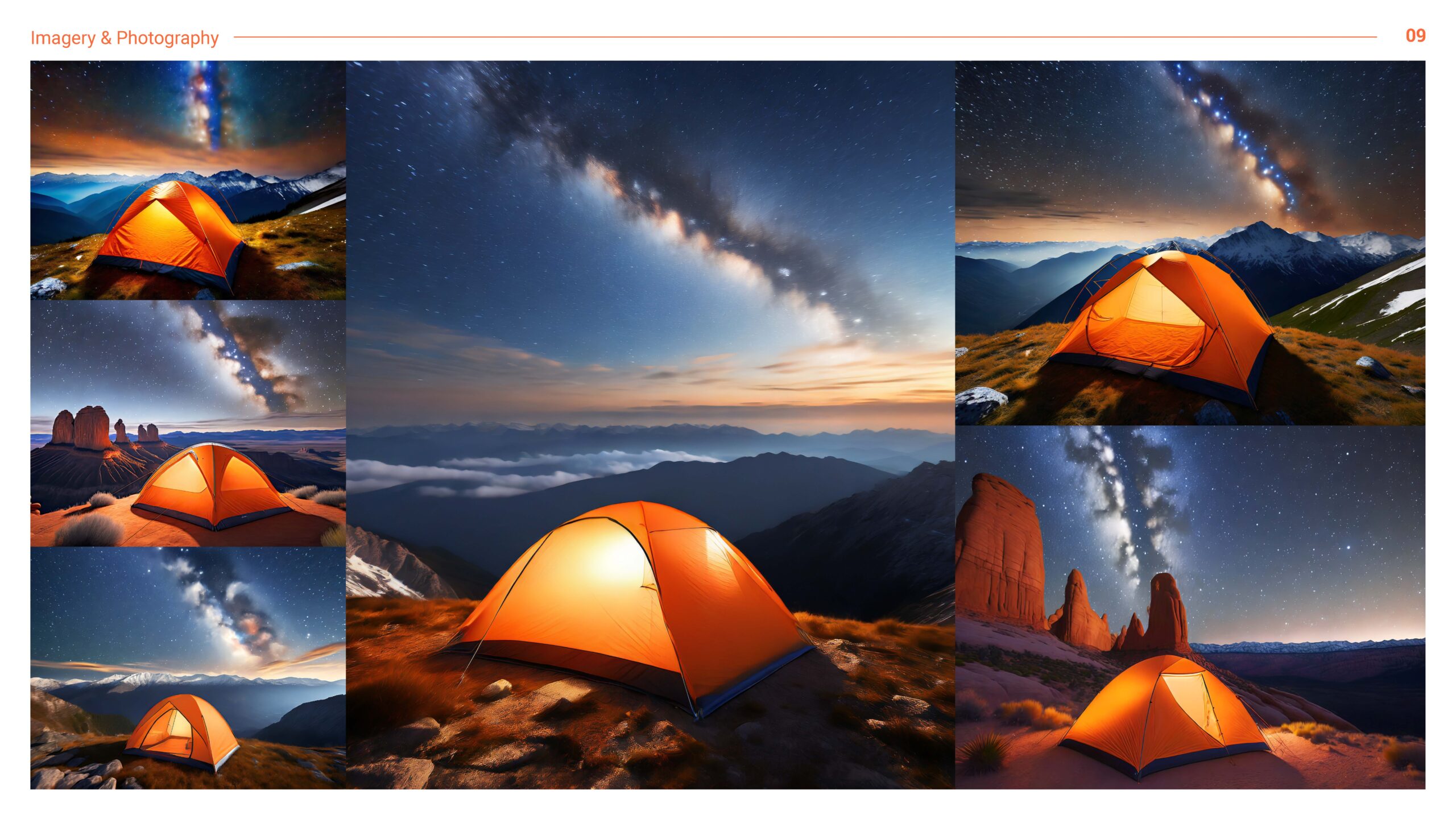
Style Guide
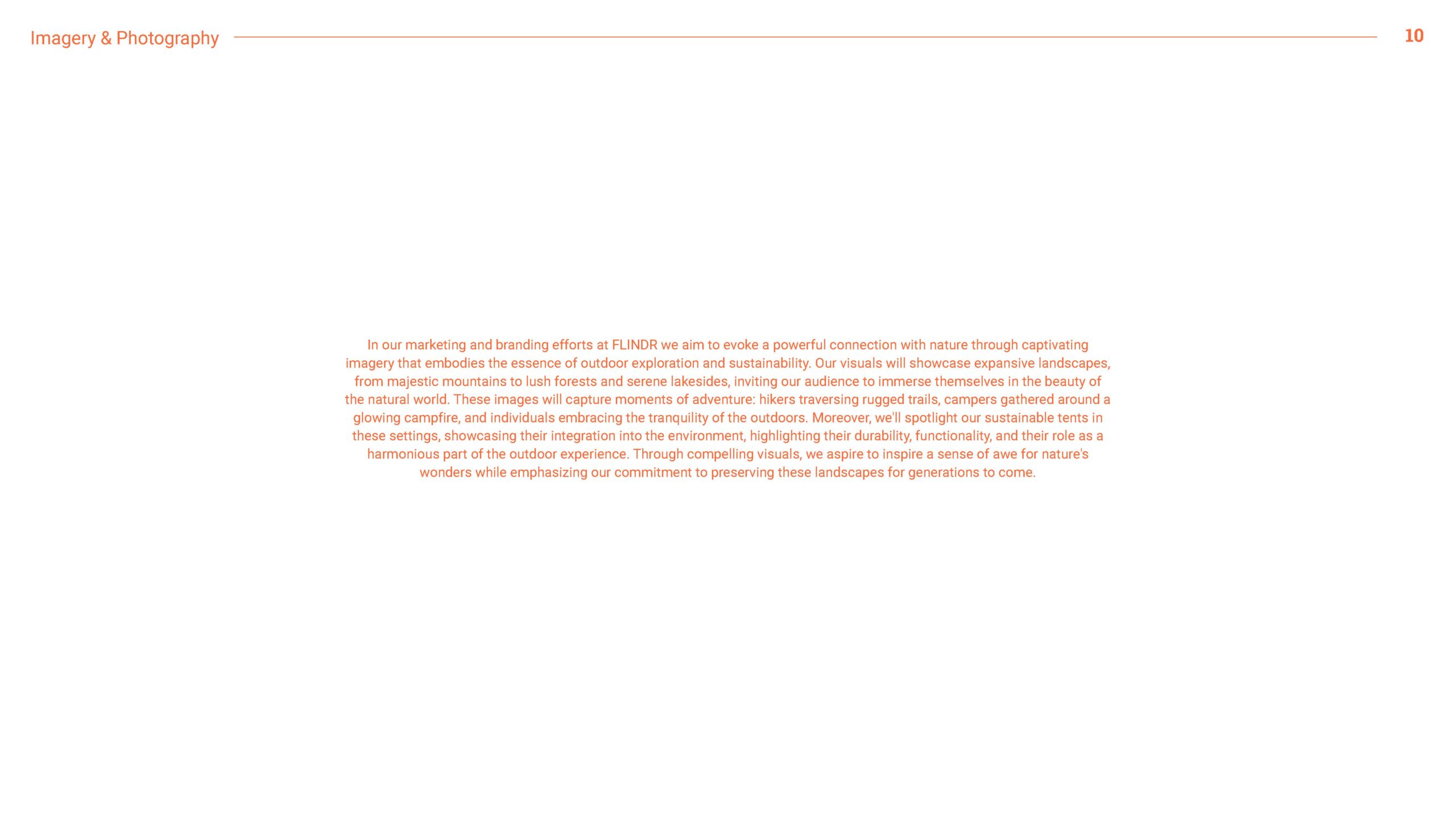
I designed the style guide to be comprehensive yet accessible, providing clear guidelinesand instructions for designers, marketers, and other stakeholders to ensure consistency inthe brand's visual identity across all touchpoints. I chose each element of the style guide,from the color palette and typography to the imagery guidelines and brand elements, toreflect the brand's ethos of sustainability, outdoor adventure, and environmental goals.